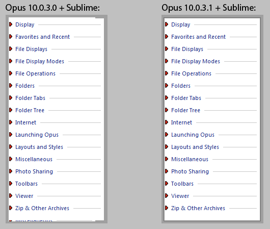
- Fixed in 10.0.3.1.
- N/A. (Bug in Opus.)

WindowBlinds 7.30a fixed the gutters and I've worked around the glyph colors in Opus by drawing the glyphs without using the theme if the normal and hot text colors are different. (If the colors are the same then the glyphs should be readable in both states. There aren't separate hot versions of the glyphs.)
The SystemParametersInfo:SPI_GETFLATMENU stuff is removed in Opus 10.0.3.2, thanks to changes in WindowBlinds 7.30a that mean it is no longer required.
- Fixed in 10.0.3.1, tweaked in 10.0.3.2 to take advantage of changes in WB 7.30a.
- Fixed in 7.30a.
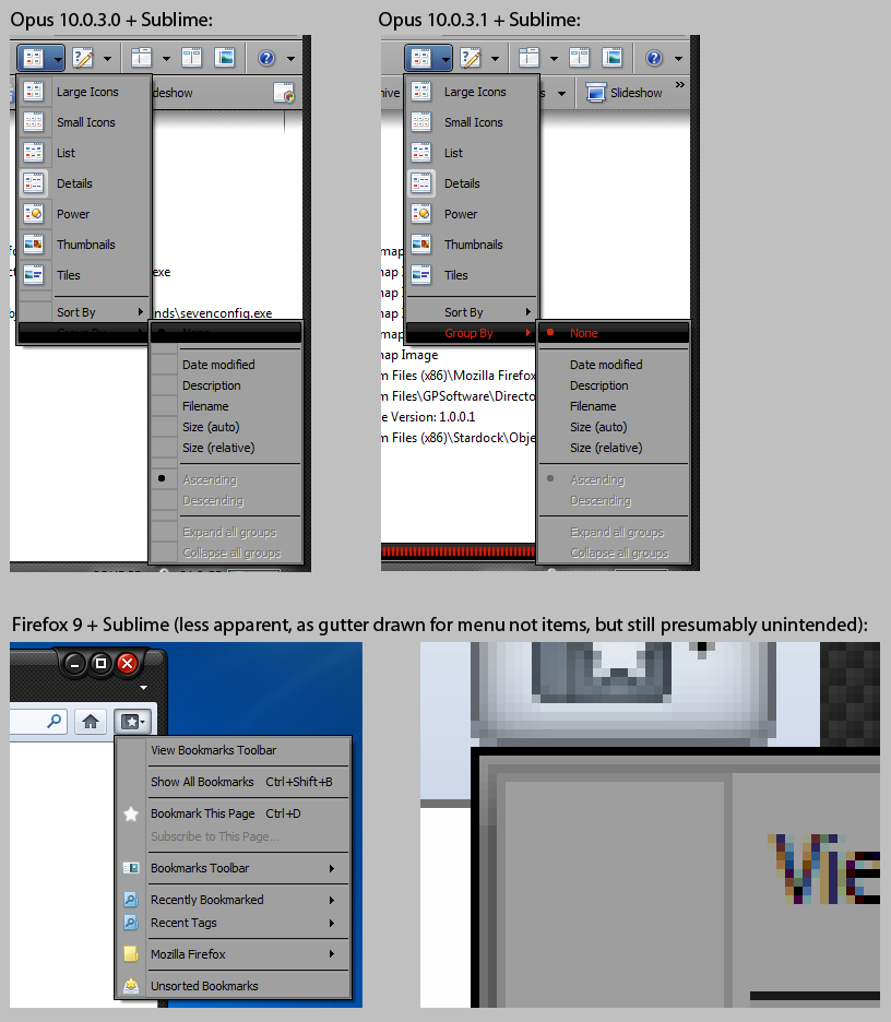
This was due to the themes' "normal menu item" background being opaque instead of transparent as in the standard Windows Aero menu theme.
- Fixed in 10.0.3.1. (The "normal item" background was being drawn on top of the drop-down arrow by mistake, but the mistake was invisible with most styles.)
- While this was definitely a bug in Opus, it would still make sense for Sublime (and any similar styles) to draw nothing, instead of an opaque background, for the normal-menu-item element, so that it conforms to the standard styles (which are the closest thing anyone has to API documentation in most cases).

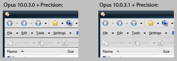
- Fixed in 10.0.3.1. (Kludge: if the drawn grip is entirely opaque we guess the background colour and remove it.)
- Precision (and any other visual styles with the same behaviour) should IMO be changed to draw resize grips with a transparent background like all the standard visual styles (which are the closest anyone has to actual theme API documentation). Open to debate, though, and not a big deal.

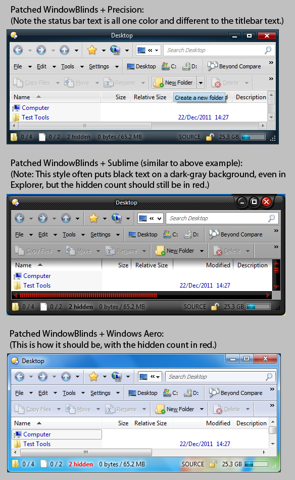
Strangely, this does not happen with WindowBlinds unpatched and detecting Opus. I have no idea why, given standard behaviour with Windows Aero is to honor the colors.
Note: Opus can be configured to render the status bar without glass, so this isn't a showstopper, but it still seems wrong.
- N/A. (Not an Opus issue, as far as I can tell.)
- Fixed in 7.30a.
- Fixed in 10.0.3.1.
- N/A. (Bug in Opus.)

Opus tried to draw the frames using DrawThemeBackground with PartId=0 and StateId=0 but the LISTVIEW and TREEVIEW themes (and/or their Explorer::* versions) within some WindowBlinds styles are missing those elements.
To work around this, Opus now tests GetThemeBackgroundExtent and, if it does not expand the rectangle for a frame, calls DrawThemeEdge instead of DrawThemeBackground.
This is not ideal, since it means the frames don't always match other control frames, but in my opinion the real fix is needed to the visual styles themselves; the styles should not contain themes which are missing parts present in the standard Windows Aero style's equivalent themes (which is the closest anyone has to API documentation on how visual styles behave). Especially for the PartId=0,StateId=0 parts.
- Fixed in 10.0.3.1. (Workaround for older WB, and should be perfect with WB 7.30a.)
- Fixed in 7.30a.
The underlying cause is the same as the previous issue (D7), since the color was being taken from the frames, which were not being drawn by some styles.
(It seems like there must be a better way to get the shadow color for a theme, but we must have tried other ways before resorting to the kludge of reading colors out of rendered theme elements. Will check that again, however, though it's not urgent as things seem okay.)
- Fixed in 10.0.3.1. (Not perfect, need to test better way/suggestions.)
- N/A.
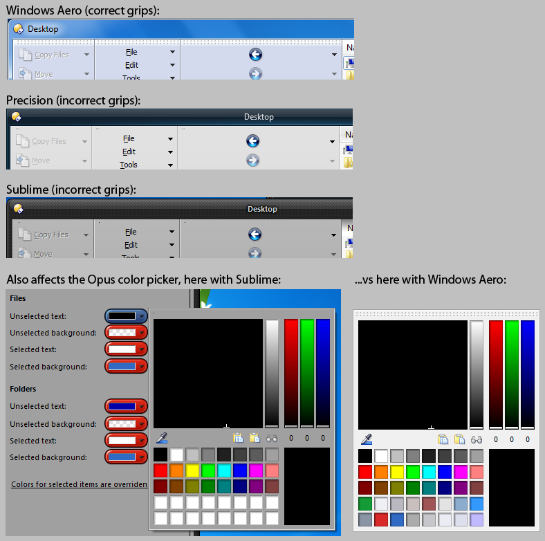
With some WindowBlinds styles (e.g. Precision and Sublime), both elements are a vertical strip, leaving just a little dot or two for the grip at the top of vertical toolbars and the color-chooser in Opus.
(If you don't see any grips at all in Opus, you may need to unlock the toolbars or enter Customize mode.)
- N/A. (Bug in the WindowBlinds styles that we cannot easily work around.)
- Fixed in 7.30a.
The buttons in question are "windowless" controls, where the BUTTON theme element is drawn directly into part of the color-chooser window.
At a guess, WindowBlinds is applying this affect to any window with particular styles (e.g. no border; or some other heuristic) when it draws a hot BUTTON element into itself, on the assumption that the window itself is a button. If my guess is true, WindowBlinds needs to improve the assumptions and conditions it uses to decide when and where to do this. e.g. Only apply the effect to the area where the button element was actually drawn, and/or don't apply the effect to such a large, top-level window.
- N/A. (Bug in WindowBlinds.)
- Fixed in 7.30a.
From debugging, this seems to be because Sublime causes bogus/inconsistent window sizes/metrics to be reported to applications. Those bogus size values trip sanity-checks in our animation code and cause it to bail out. (I tried removing the sanity checks and the result is completely messed up animations.)
This is most likely related to issue W12, which affects most WB styles but affects Sublime more than others.
Further info: Sublime breaks the transition animations of any file display that is touching the right-hand edge of the window it is in, due to (I think) the window-metrics issue causing Opus's layout code to position the right-hand edge of the file display slightly outside of the top-level window's client area. Similar problems, or glitches like animations which cause the window contents to be offset while playing, may affect other themes/situtations, but Sublime seems the worst as it makes the window metrics further out than most others.
- N/A. (Bug in WindowBlinds or Sublime.)
- Window metrics should be corrected.
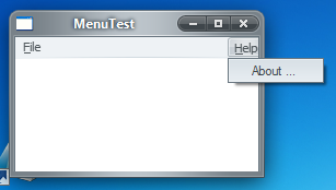
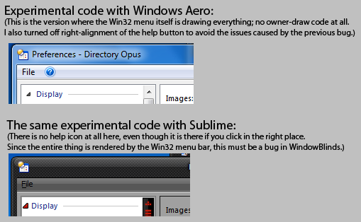
This is not a bug in Opus; the help button in is being positioned by the standard Win32 menu control.
The styles which cause this problem will do so with any right-aligned menu on any standard menu bar. That includes menus with simple text labels.
The problem is easier to see with some styles than others. Sublime makes it easiest to see (modulo the black-on-dark-gray text). Presumably its wide window borders are somehow related to the problems the standard menu control has in determining the width of the window? (Could this tie into D11 and the broken transition animations with Sublime?)
With other styles, like in the second screenshot below, it can be harder to notice because the clipping isn't enough to eat into the label but does still eat into the menu-item's frame. In that second screenshot, note that the label is right up against the edge of the window, not indented like the File item is on the left, and also note that you cannot see the right-hand edge of the Help item's frame.
The MenuTest program shown below is just the Visual Studio 2008 template Win32 GUI application with a single change: Giving the "Help" menu RightJustify=TRUE in the menu resource.
This is almost certainly a consequence of issue W12.
- Workaround in Opus 10.0.3.1. Based on issue W12, Opus detects the WindowBlinds non-client metrics error and increases the width of the Help menu item proportionally, so that it is still clipped but the icon itself looks correct.
- Definitely a bug in WindowBlinds.


While this will require a code-change in Opus (Opus currently draws the solid square background itself), several problems in WindowBlinds have prevented me from finding a way to fix it.
The button is currently an owner-draw menu item (MFT_OWNERDRAW) where the WM_DRAWITEM handler fills the solid menu background color.
- If the WM_DRAWITEM handler is changed so it doesn't draw any background at all, and paints on top of whatever is in the HDC given to it by the OS, then this works fine with Windows Aero but results in a solid black background with the WindowBlinds styles I tested. So we can't do that. (Unless there's some unwritten requirement to do something special regarding the alpha channel, which I didn't think to try. But that isn't needed for Windows Aero, anyway.)
- If the WM_DRAWITEM handler is changed to explicitly draw the MENU theme's background, that doesn't work either.
Some themes don't seem to even have a MENU background element (or if they do it doesn't match what is actualyl drawn on the menu). Others have the background a element but only one them, and draw a different background when the window is active and inactive. (So when the window is activated/deactivated, the backgrounds no longer match up.) It looks like some WindowBlinds themes also make the top-level window translucent in the menubar area, which probably complicates things.
- I also tried changing the menu item from being completely owner-draw to just having an owner-draw bitmap (MFT_OWNERDRAW cleared from fState, MIIM_BITMAP added to fMask and hbmpItem set to HBMMENU_CALLBACK). That also works great with Windows Aero but fails with the WindowBlinds styles. (I can't remember if it resulted in a black background or no icon at all.)
- Finally, I tried letting the menu control do all the drawing itself -- no owner-draw or WM_DRAWITEM handler at all -- by converting the icon into an RGBA 32bpp bitmap and setting it as hbmpItem when adding the menu item. That works great with Windows Aero but draws nothing at all with any of the WindowBlinds themes.
- Fixed in 10.0.3.2, thanks to changes in WB 7.30a.
- Fixed in 7.30a.
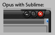
- N/A. (Bug in the WB styles.)
- Fixed in 7.30a.
(Keyboard focus is on the Videos library, but there's no outline around it.)
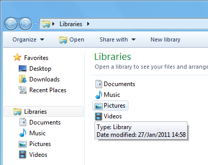
(See the 4th video from my earlier set for better examples in both Explorer and Opus.)
(Obviously, the rest of this page was based on testing against a patched version of WindowBlinds where its detection of DOPUS.EXE was hex-edited out.)
- N/A. (Bug in WindowBlinds.)
- Fixed in 7.30a.
Looks like Precision is not painting the bottom row of pixels for that element. (Also results in the whole width of it being randomly black or white sometimes.)
Affects Opus dialogs like the Filetypes editor and standard Windows apps like Notepad and Task Manager.
- N/A.
- Fixed in 7.30a.

Notepad:

Task Manager:

With Sublime on XP, opening any child dialog of the Opus licence manager causes the minimize box to jump over to the left half of the dialog, then back again when the child closes.
I haven't the foggiest idea what might cause this, although it's worth noting that the top-right edge of the window borders is wrong from the moment they open and things get worse from there.
- N/A.
- I think this has been reported fixed, although I haven't taken the time to re-test it myself.
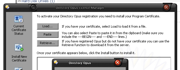
Video of what happens:
D17b.mp4
- White lines and other artifacts to appear along the top edge and all four corners of the active window.
- Where a glass placeholder represents the other windows, the glass shine texture does not reach the edges, leaving conspicuous gaps between the shine and the outline. Most visible at the top, but happens on all four sides.
- Bug in WB affecting all applications.

- Fixed in 7.30a.
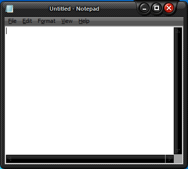
e.g. With Notepad (with status bar turned on), or MSPaint, you get a window with two resize grips at the bottom.
In some cases the extra grip is in the middle of the window which makes even less sense.
(The extra grips are not there with other styles so it's not just the apps making a mistake, which can happen as well, e.g. TextPad.)
- Bug in "Win8" style.
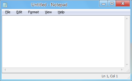
MSPaint + "Win8":
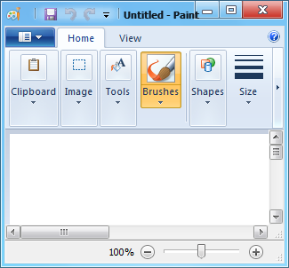
MSPaint + Windows Aero:

Windows file permissions dialog + "Win8":
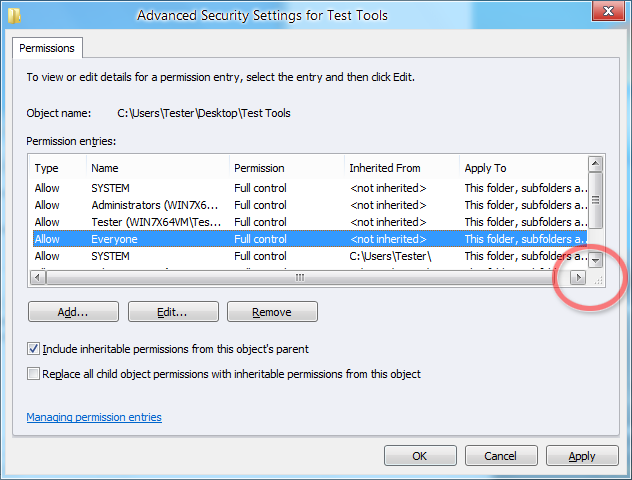
- Fixed in 7.30a.
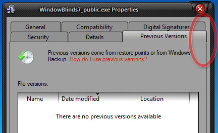
- Fixed in 7.30a (top-right corner not perfect, but it's much better).
- Whatever the reason, disabling themes entirely for DebugView is overkill.
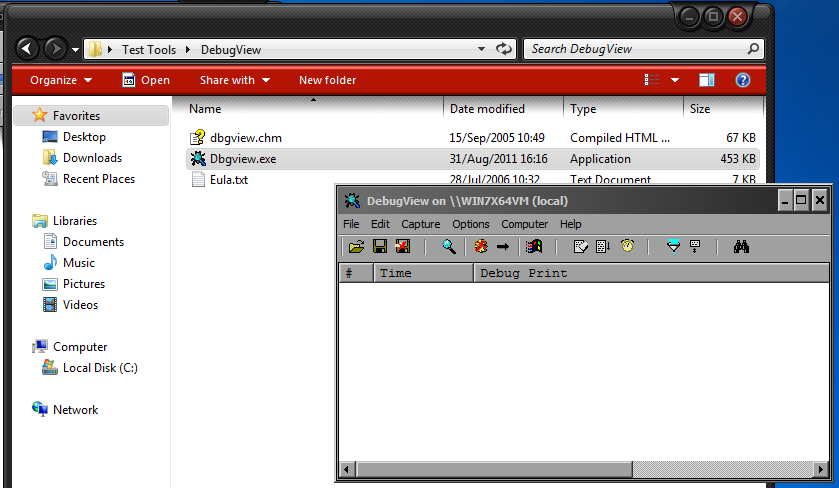
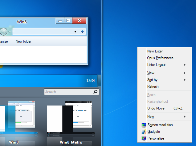
This appears to be caused by the style's MENU theme misreporting its gutter width as zero.
The same theme causes two different problems with Firefox 9 where the gutter has a box drawn around it and the horizontal separators start too far to the right.
(From what I can tell, Firefox is using the theme's gutter element and that's where the box is coming from. I'm not sure why the system isn't drawing the same box; maybe the system code falls back on its own gutter-rendering if the theme reports a zero-width element. Either way, both the standard menu-rendering code and Firefox's code look wrong, in different ways, with this style.)
- Bugs in "Win8" style.
(Note the position of the icons in the menu.)
Firefox 9 + "Win8" style:
(A box, which comes from the theme itself, is drawn around the menu-gutter; the horizontal separators also start too far to the right.)
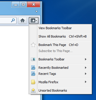
(Firefox should look a bit better in WB 7.30a, though I haven't tested. Windows itself and Opus still have problems with separator positions and/or icon placement.
- Checkmark
- Disabled Checkmark
- Bullet
- Disabled Bullet
With the Sublime style, the first three glyphs are correct but the disabled-bullet glyph is identical to the normal one, without any ghosting etc.
(I noticed the same problem with at least one other style but didn't note which it was. Most of the non-Opus problems on this page should be checked against the other styles since I wasn't actually looking for problems in the styles and just made a not of the ones I stumbled upon while testing Opus.)
- Fixed in 7.30a.

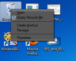
...as soon as you move your mouse over that item, it is re-drawn in the enabled state.
I checked several times and it always happens with Sublime and never happened with Windows Aero.
I later noticed the same problem with another theme, I think Precision but I'm not certain.
- Happens less in 7.30a, but right-click the bin a few times and you'll still see it.

Move the mouse over it and it looks enabled:
Sometimes the glitched regions fade in and out or move around, which really draws attention to them.
(Contrary to my earlier assumptions, it turns out this was just a bug; the styles in question were in fact designed for Win7 and something just got messed up, and is now fixed.)
- Fixed in 7.30a.
W010.mp4
Some screenshots:
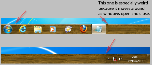


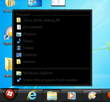
Sublime also has white backgrounds in other places, making the low-contrast, dark-gray-on-black (or vice versa) areas even harder on the eye because they're next to big white panels.
Surely these color combinations were not intentionally chosen with Windows 7 in mind?
This, along with the various other problems I ran into, gave me the impression that, while they may have worked great in the past, at least some of the styles that ship with WindowBlinds were never properly used/tested/updated for Windows 7.
- Fixed in 7.30a (Explorer details panel still the same, FWIW.)


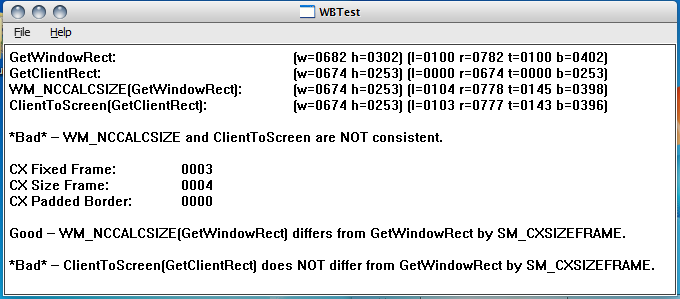
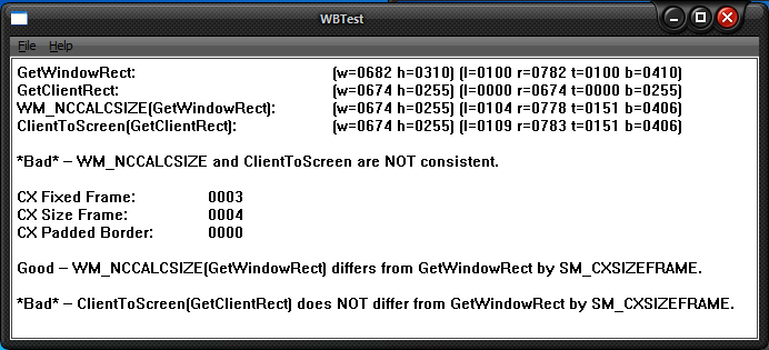
All of the non-Aero styles, except the "Metro" one, are incorrect for resizable windows. It seems to be pure luck that Metro is correct for resizable windows, as it is still incorrect for fixed-size windows.
Some styles are more incorrect than others, e.g. Sublime is out by five pixels (ten if you count both edges) while most of the others are out by less. The style that's a clone of OS X is out by a negative offset.
This most likely explains several problems that WindowBlinds causes, e.g. the standard menus mis-calculating the width of the window, and Sublime breaking Opus's transition animations.
Another thing that seems odd is that the disparity between WM_NCCALCSIZE and ClientToScreen only happens once a window has been shown on-screen. If the window remains hidden, or is shown but in an off-screen position, the metrics are still consistent. So, while I'm not entirely sure, it seems like something that WindowBlinds breaks the first time it paints the border around a window. That makes it a pain to detect the problem and apply corrections to layout code since the problem doesn't manifest until the window is already on the screen.
This is essentially breaking several parts of the Win32 API contract.
The WBTest.zip program (source included) was used to investigate this and make the screenshots below. The version in the zip file lets you test both fixed-size and resizable windows, although only resizable ones are shown in the screenshots below.
- Bug.
Windows Aero, Luna, Classic and all standard styles give consistent metrics:
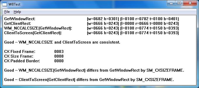
Every WindowBlinds style I tried, other than Aero-based ones, broke the metrics for either resizable or fixed-size windows (and usually for both):
